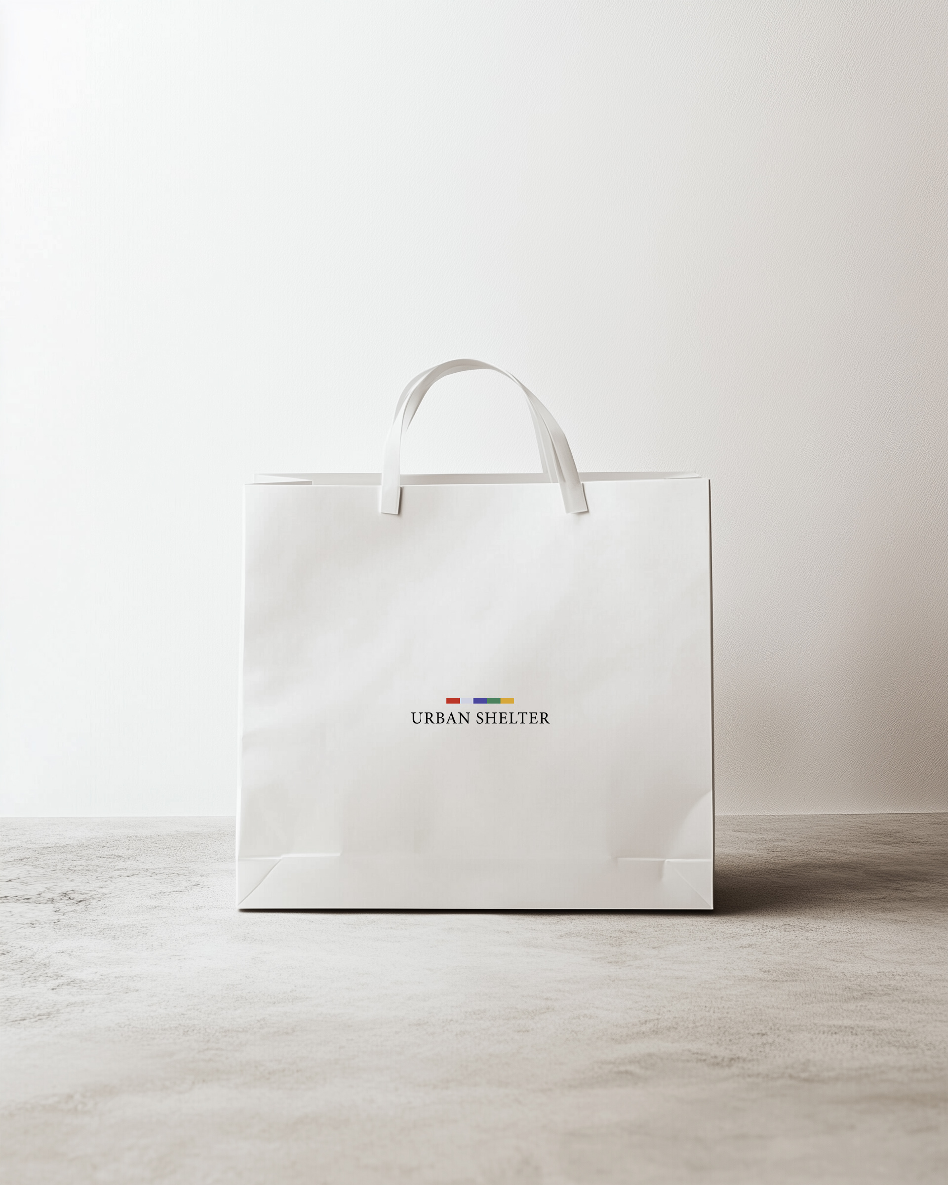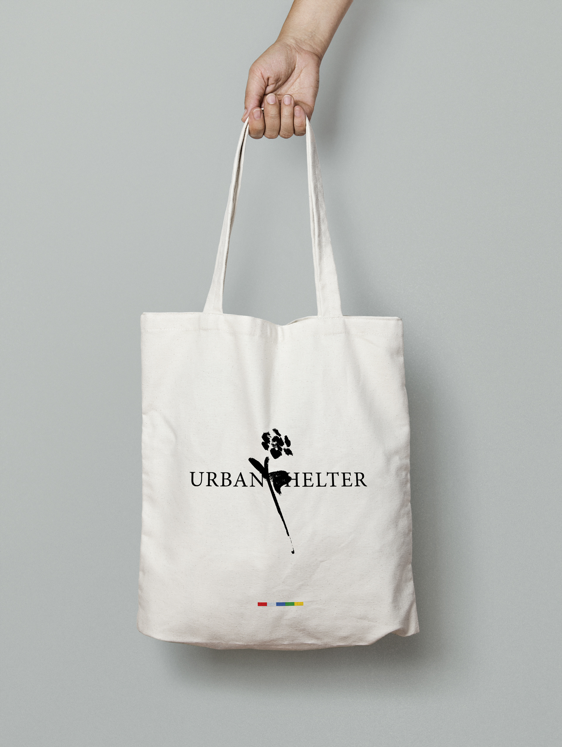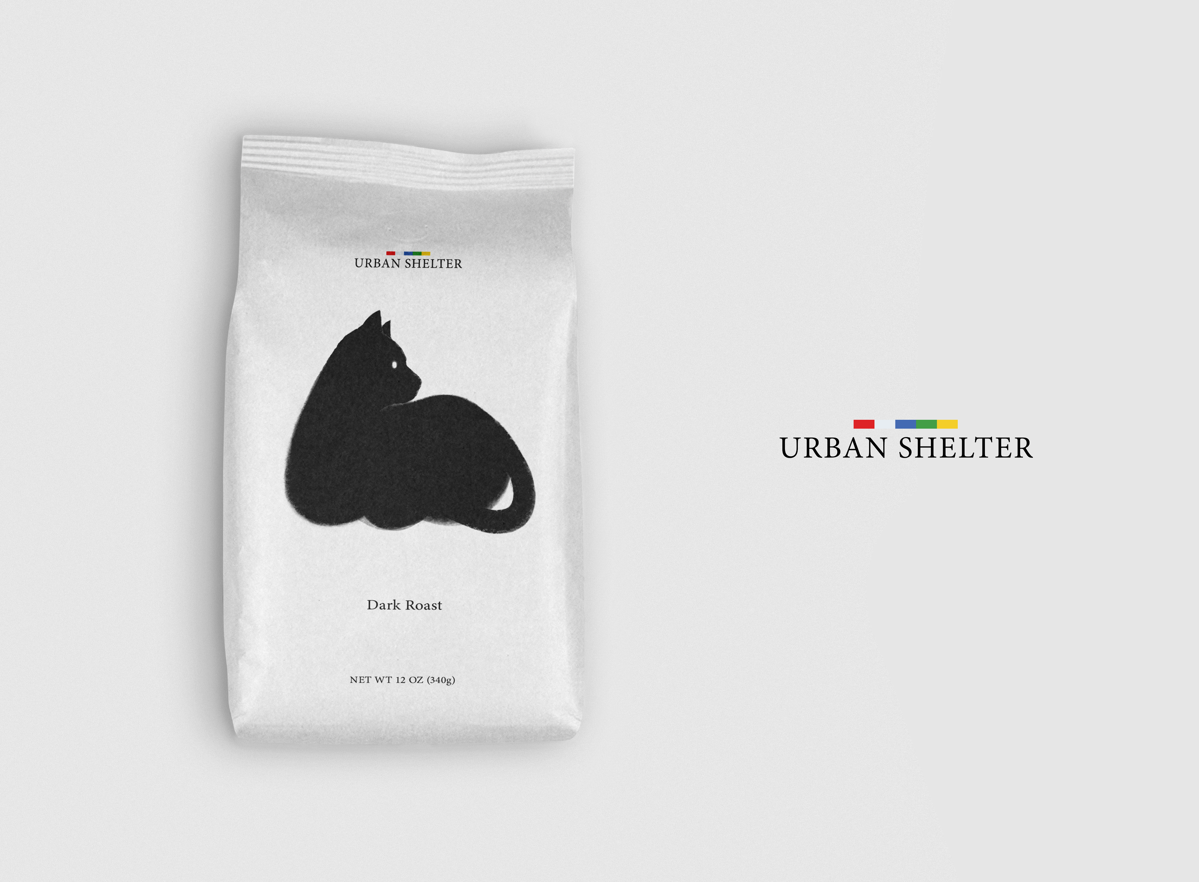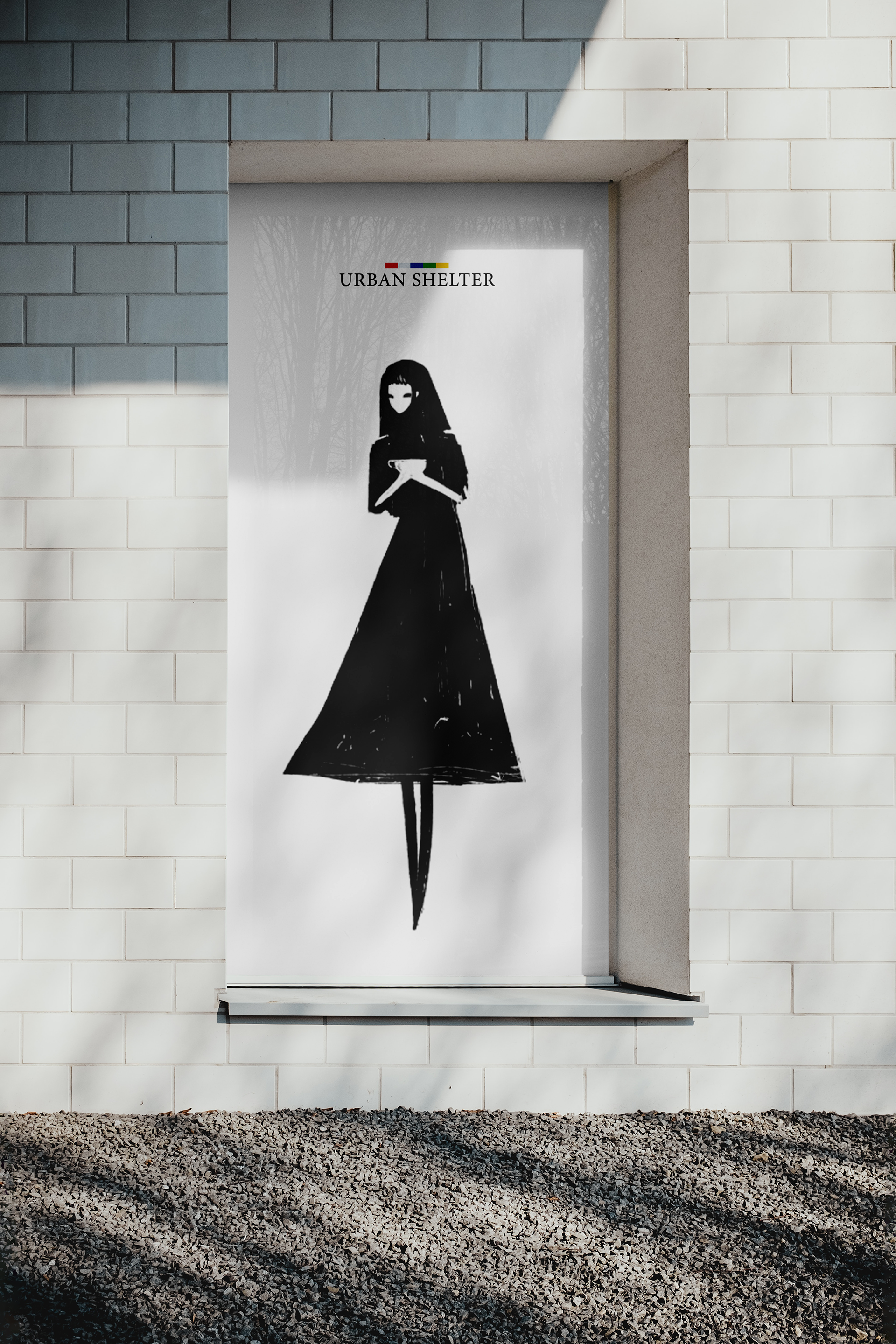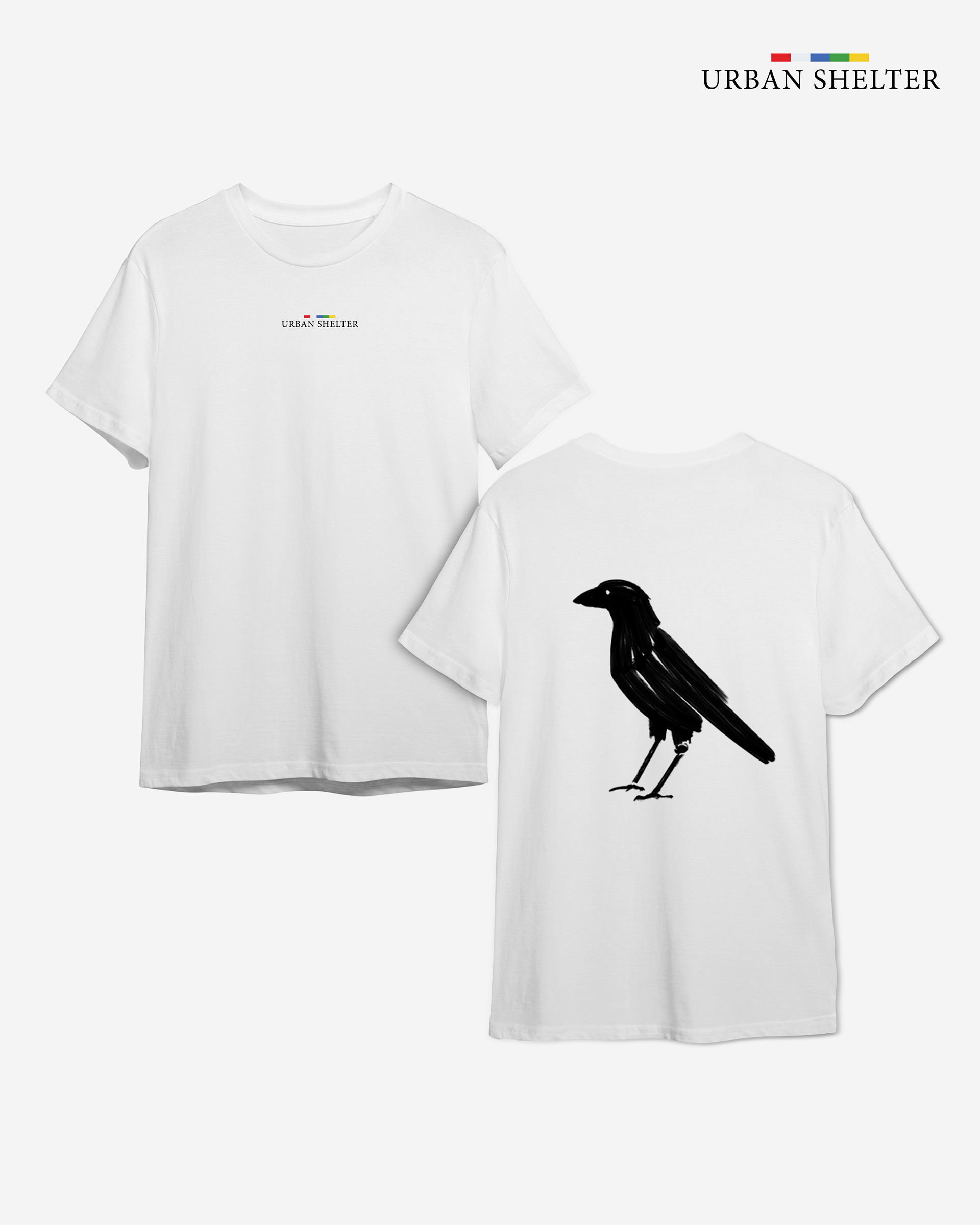

Urban Shelter – Minimal, Mindful.
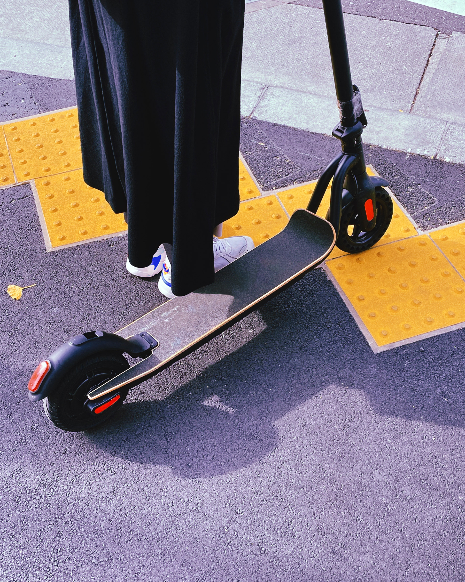
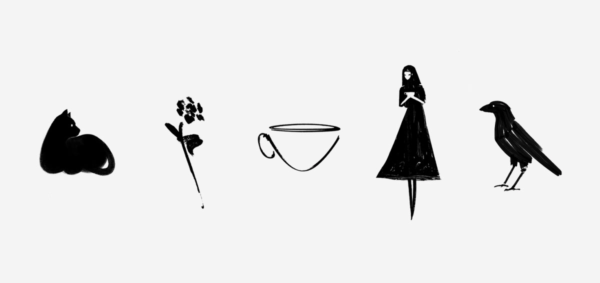
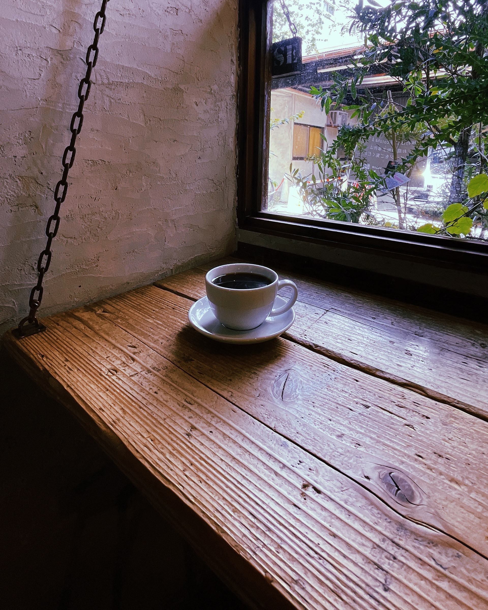
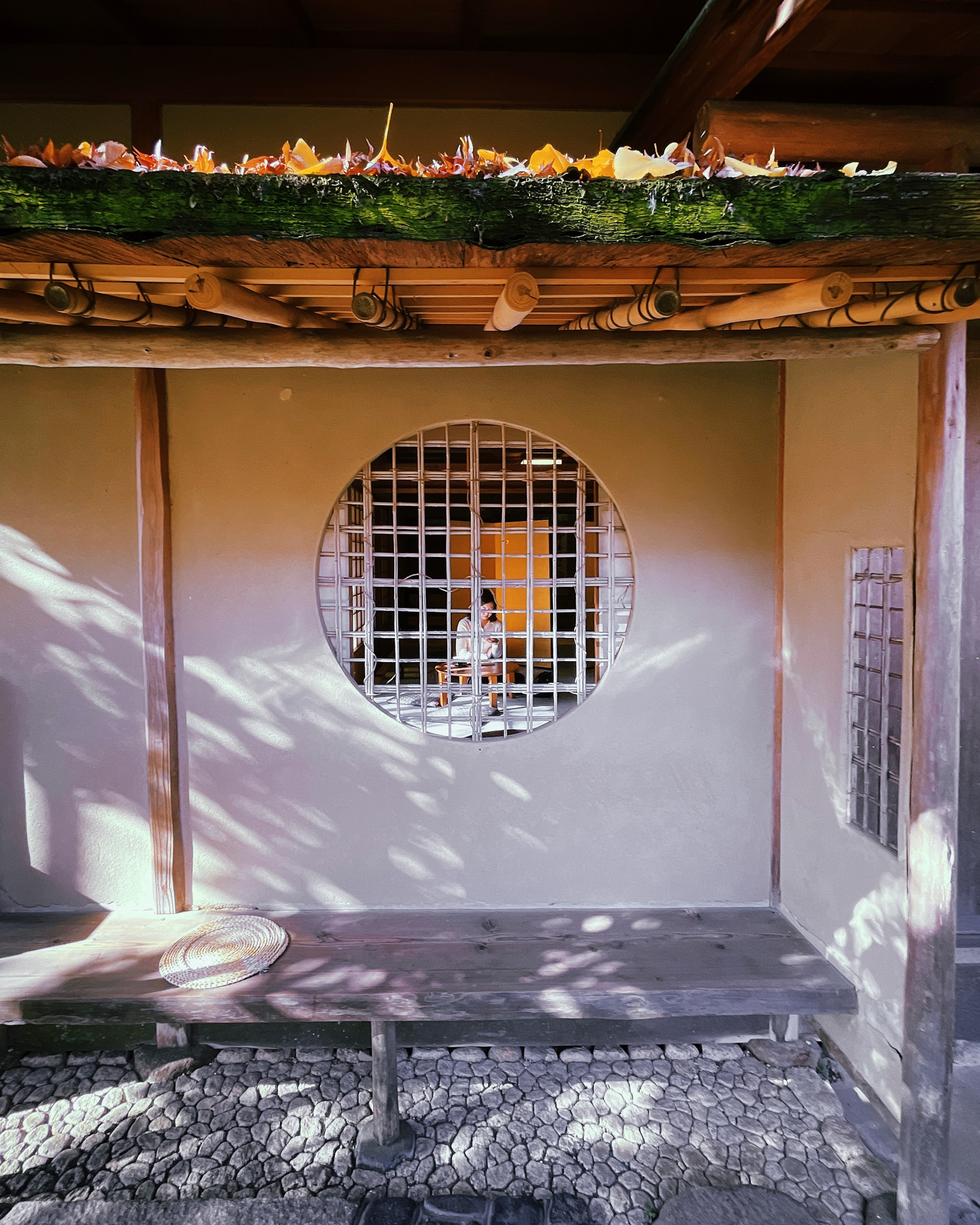
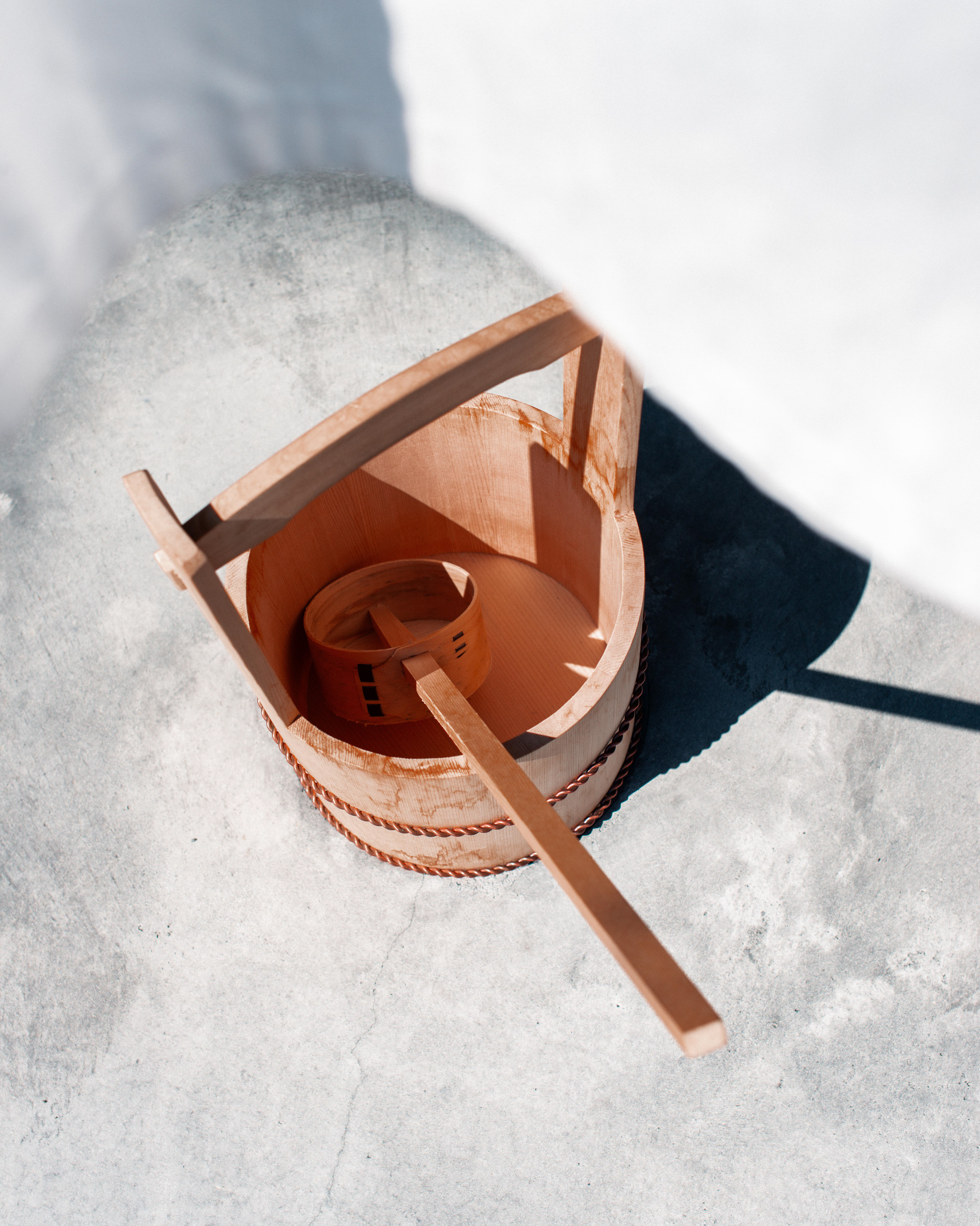
Urban Shelter draws from time spent in Japan, where a new way of living emerged—rooted in Zen, minimalism, and mindful design. Blending philosophy with aesthetics, the project promotes peace and clarity in a fast-paced world through thoughtful branding and packaging. It offers both a visual and conceptual retreat, designed to support balance and well-being.
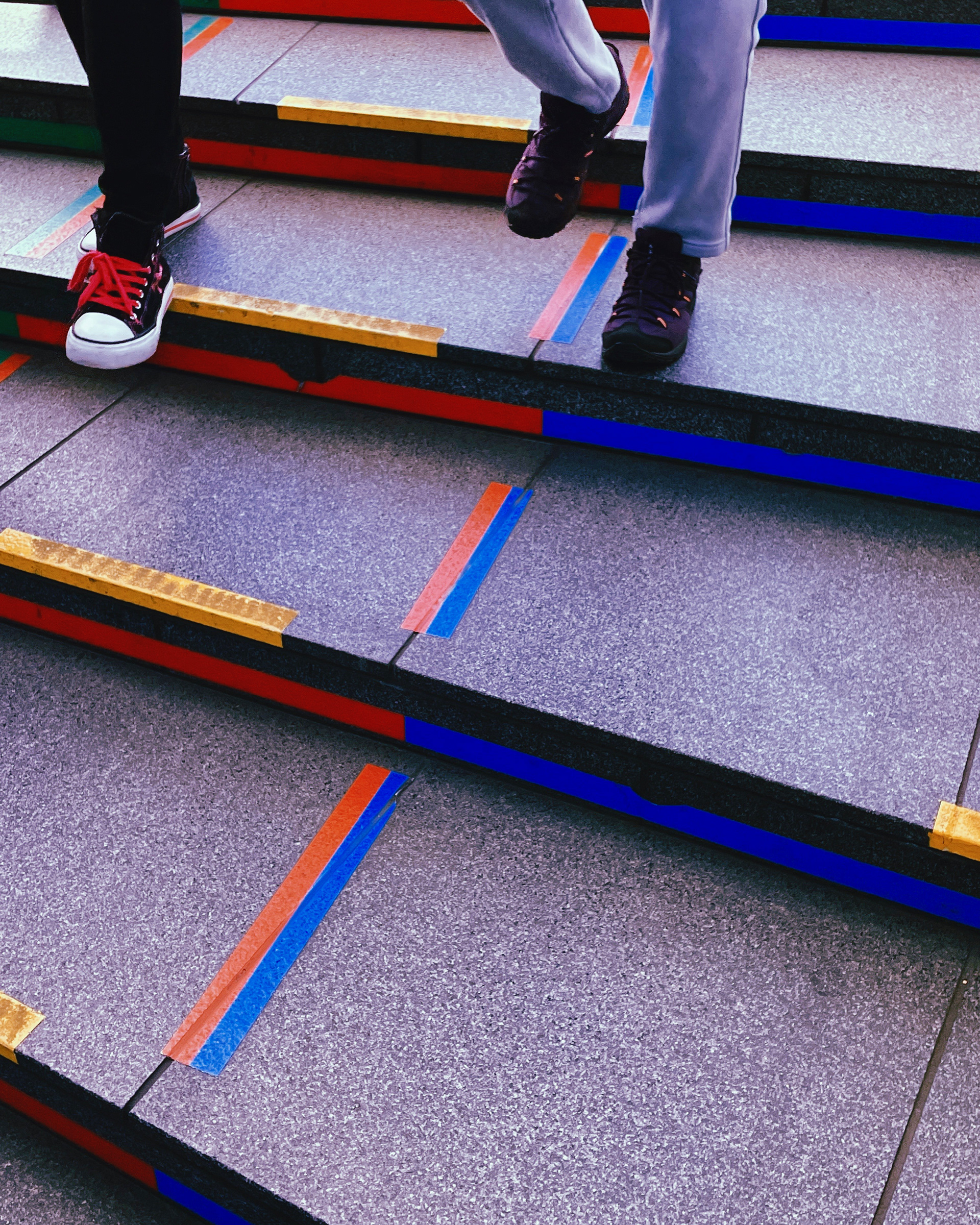
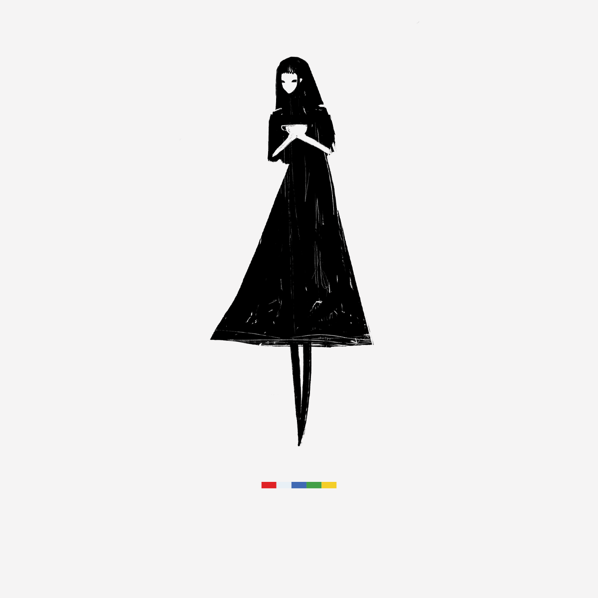
The identity is inspired by go-shiki-maku (五色幕)—five-colored temple flags symbolizing the harmony of elements in Buddhism: blue for water, yellow for earth, red for fire, white for air, and green for wood. In the brand, these colors become a metaphor for unity, reflecting the integration of ancient wisdom with modern creativity. Just as the flags evoke mindfulness and reflection, Urban Shelter champions purposeful innovation and inner calm.